1. Audi: The four rings of the Audi logo each represent one of four car companies that banded together to create the company.The four companies were namely: Horch, DKW, Wanderer and Audi. They were forced to ally by depressed market conditions to form Auto Union. After the war, the company finally took the name Audi which is Latin for “I hear,” a translation of the name of August Horch. 2. Dominoes: The very first Domino’s logo was created in the 1960’s. The three dots on the logo symbolize the three original Domino’s locations that were open at the time. As the company planned to work hard on franchises, they planned to add a dot each time that a new location opened. Of course, with the incredible success of the Domino’s brand, this plan was scrapped because the logo would otherwise need thousands of dots. 3. BMW: BMW’s logo is a tribute to the company’s history in aviation. The logo shows a propeller in motion with the blue part representing the sky. This is due to the company’s role of building aircraft engines for the German military during World War II. 4. Mercedes Benz: Mercedes’ tri-star represents the companies dominance over land, sea and air. The famous three-pointed star was designed by Gottlieb Daimler to show the ability of his motors for land, air and sea-usage. 5. Sony Vaio: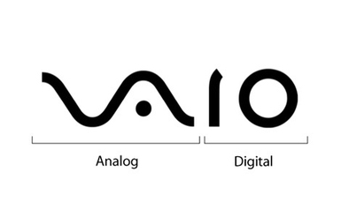 At first all you see is modern typography, but there is actually a hidden meaning of Sony’s VAIO logo. The first two letters represent an analog signal and the last two are the 1 and 0 of the digital world. 6. FedEx: This famous logo was designed by Linden Leader and Landor Associates in 1994. On first impression, this logo appears rather simple. However, when looked at closely, there is actually a visible arrow between the “E” and “x” in the logo. This white and right facing arrow is a symbol of speed and precision. 7. Northwestern Airlines: In the words of Pilot Patrick Smith, this old logo of Northwest Airlines was “quite simply, a work of genius. It was an N; it was a W; it was a compass pointing toward the northwest.” It was redesigned in 2003 with one conspicuous change being the erasure of the capital N. 8. Amazon.com: Amazon’s simple logo which represents that almost everything from A to Z is available on their website. The arrow also represents the smile on a customer’s face after a purchase. 9. Unilever: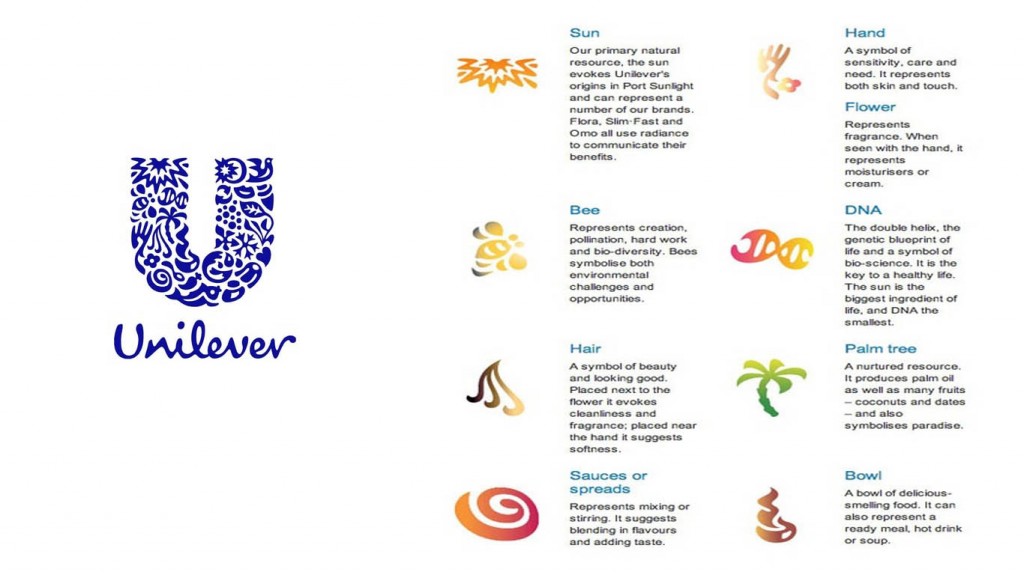 Unilever produces literally thousands of different products, thus the letter U is made up of symbols representing all these products and what they mean to their consumers. Each part of the logo has a meaning, which you can check out below. 10. Dell: In Dell logo, you’ll notice that the “E” in Dell is turned on its side. The reason? It represents company founder Michael Dell’s wish to “turn the world on its ear.” 11. Picasa: The Picasa logo has a lot more than meets the eye. The colorful portion of the logo represents a camera shutter, while the white space within the logo represents a house. Casa means “house” in Spanish, while “Pi” can be shorthand for Pixel Index. Put them together, and you have a house (i.e a depository) for your photos. 12. Ubuntu: The Ubuntu logo depicts an overhead shot of three people joined together, holding hands, and looking up towards the sky. All in all, a rather clever and fitting logo/name combination, as the word Ubuntu means “Humanity”. 13. Facebook Places: When Facebook Places was launched, Four Square was already an established competition for check-in apps, and hence in the logo of Facebook Places you’d notice the arrow is mounted upon the numeral 4. 14. Baskin Robbins: Baskin Robbins started with 31 flavors of ice-cream which is quite evident in their logo that has the number 31 in pink. 15. Bluetooth: Ericsson’s Bluetooth logo named after tenth century King of Denmark, Harald Bluetooth. The logo is a combination of two Germanic alphabets Hagall. 16. Sun Microsystems: The SUN Microsystems logo is a wonderful example of symmetry and order, as the letters U and N while arranged adjacent to each other look a lot like the letter S in a perpendicular direction. This also means the logo reads SUN from whichever direction you see it from. It was designed by professor Vaughan Pratt of Stanford University. It is an ambigram, which is defined as a typographical design or artform that may be read as one or more words not only in its form as presented, but also from another viewpoint, direction or orientation. 17. The Hindu: Those of you who care to know the significance behind the logo of the famous newspaper in India, here it is. 18. Carrefour: Carrefour is a a French multinational retailer. The name of the company means crossroads in French. The logo features the letter “C” between two arrows that point in different directions. 19. Toblerone: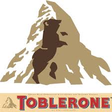 There is a hidden bear in the Matterhorn high mountain image because Bern (their original place of manufacturing) is also called “The City of Bears”. Apparently, the chocolate makers wanted their American customers to know that these bars were indeed imported from Switzerland but for some strange reason, they were not allowed to print this piece of information on the pack. Hence, they came up with the idea of having a new logo and also the now legendary triangular shaped bars. (Sensory branding!) 20. Le Tour De France: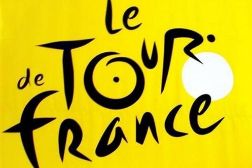 In addition to the yellow circle represents the sun indicating that the race takes place only during the daytime, you can see a hidden cyclist in their logo. |
Ankit
|


 RSS Feed
